They also made the official announcement of the new sweaters with this graphic.

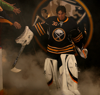
The ceremony, which began after a team scrimmage, featured each member of the team stepping out onto the ice in the new sweater. Ryan Miller got things started, giving fans their very first look at the new duds.

It's a great redesign of their classic look — with an update of the logo and blue uniform.
We got a decent look at the full uniform when Maxim Afinogenov and Drew Stafford stepped out. You can see the Sabres will keep the sweater number on the front shoulder and add new socks to match the jersey.


You'll also notice a silver area under the arms in this picture of Teppo Numminen. They're very sharp jerseys.

Once everyone was out there, the players skated a few laps around the ice and waved goodbye to fans.

The Sabres had the following statement regarding the new sweaters on their web site.
Utilizing the original crest from the 1970s, the logo has undergone minor modifications for an overall vintage appearance.
“The first thing we wanted to do is go to our new color scheme, which is the deeper blue and gold,” said Director of Creative Services, Frank Cravotta. “After that we added the striping pattern, introduced some silver accents in it and put some silver vertical piping along the front… It makes for a new and unique look.”
The jersey also encompasses a tie at the collar to “reinforce the retro style,” according to Cravotta.
I couldn't agree more with Cravotta's statement. And to every person saying the vertical piping is "unnecessary"... can you please define what is necessary outside of a uniform that identifies a group of players as teammates? Stuff like that has me in stitches.
I've set up a photo gallery for the Sabres' third jersey. Right now, it's made up primarily of screenshots from the live broadcast of the event on Sabres TV. I'll add more images when they're available.
If I hear anything else or see any better photos of these sweaters, I'll be sure to keep you updated.


45 comments:
Overall, a good looking jersey, but I was never a fan of that logo...
Still not really sure about that silver piping on their sides, but a great looking jersey anyway. I really hope they are our primary home jersey next season.
From this angle the piping actually looks kind of cool. Looking good.
Overall pretty good but they need to lose the numbers on the front.
First of all, as a longtime fan of the expansion cousin Vancouver Canucks, I would like to pass along my sincere congratulations to all the fans of the Buffalo Sabres. For the first time since 1996, they finally have a sweater and uniform that they can be proud about. I watched the unveiling on Sabres TV and the new sweaters look absolutely sharp. I do have four little critiques though. One, the silver vertical piping is unnecessary, two, I would have added the traditional white and gold piping on the sides of the pants, three, add the multiple strips on the socks, and four, remove the numerals from the front. Other than that, my critiques are totally outweighed by my overall approval of what I think is a great looking uniform. Hopefully, the Sabres will go with this look full-time in a year or two. Now, I only hope my Canucks have a sharp-looking third as well.
Anyway, congratulations to all Buffalo Sabres fans and supporters.
The Solid pants kind of stuck me as odd, but not as odd when I saw the slug for the first time.
Kudos to designer Frank Cravotta (Sabres director of Creative Services) for making right where the slug wronged so many.
I don't like the number on the front. The silver stripes on the sides don't factor in as much as I thought they would. Looks great with the navy.
Simply an outstanding jersey! Thank God the Sabres went back to their roots but also modernized it. Truly a great look that was long overdue. Hopefully they'll eventually make this the permanent home jersey, have a white road version and then bring back the original royal blue classic jersey as the eventual alternate.
Chris, I'm currently working on a blog post myself and also did screen captures. I'll provide a link to your blog post here for those who follow your blog daily like I do.
I rank blue like this
Navy > Royal > Powder
Powder topped my list 3 years ago, but it's this decades "teal"
Excellent! Loving what I see! I'm a little bummed about the lack of a secondary logo on the shoulder, but so long as the jersey is slug-free, I'm happy.
So yeah, awesome! Can't wait to get one!
I'd like to retract my comment/rant on the prior post about the Sabres 3rd. Seeing it on the players (esp. Miller) has convinced me that it is indeed a good design. The leaked picture, imo, made it look like they went too far w/ the modernization, but on the players, I barley noticed the silver accent stripes. Even the piping looks good on Miller and not terrible on everyone else. I still don't like the idea of the retro-logo/navy combo but whatevs, the jersey look good.
*barley = barely
Did Anyone Else Notice Ryan Miller Was Wearing New Pads???
numbers on the front ruin everything
Andre: thanks from a fellow member of the class of 1970. While I think the goathead era jersey were nice enough to be proud of, you are right that it does pale in comparison to the pride I felt in these (I won't even mention the feeling that I had when I saw the slug.) Watching them skate this new jersey actually got me a little choked up. After this season as a third, I can't imagine how they wouldn't go to these as their primary.
I agree that the piping needs to go and the pants should have stripes on the side, but the socks seem fine to me and I guess I am in the minority that likes the numbers on the front (I like them on my Pominville 2006-07 royal blue third, too.) I also miss the small logos on the shoulders.
Even if they were to make the switch back to these, though, we would see some tweaks over time, so I am happy just to see something that looks really nice as a step in the right direction. It may not be quite perfect, but it's a lot closer than anything that we've had in a long time.
@ NHL News
yes I did, they're the new Rbk Premiere III's.
It's hard for me to tell, but do the three stripes at the bottom of the jersey have the silver trim, such as what was leaked?
Sharp set.
My only gripe: Why on God's Green Earth would you ever put numbers on the FRONT of a hockey sweater?
uh...
pipping, big crest, laces, colorful collar, front numbers... way too busy, specially with C and A...
at least it's not the slug
Overall, very sharp. My only minor gripe is that silver piping along the side. Other than that, very very sharp unis.
they do have the silver on the striping. just the top and bottom strip. the silver is on the inside of the gold. and as for the numbers on the front, i like it, and at least its not what the other teams are doing and putting the names on the front w/the numbers under it. i was at the unveiling and i gotta say, those jerseys looked sweet out on the ice. i give them an A+.
ps - its better then one of the other designs they showed in the video about the jersey. the actually considered putting the number on the shoulder. that would have sucked.
I absolutely love these!!! i was blown away seeing them walk out of the zamboni entrence! and did anyone else notice that the center ice didnt have the slug?
as much as i dont care about the sabers
these are sweet
they are much better than the home uni's
im thinking they should wear these everynight
and update the logo more
If they put the classic logo at center ice, I might tear up. Make it happen Larry!!!
Numbers on the front and many teams with wordmarks is just the NHL aka RBK turning the NHL into the NBA.
It's stupid.
Nice jersey overall, but RBK won't let anything decent happen. Apparently we need an NBA style jersey.
"Did Anyone Else Notice Ryan Miller Was Wearing New Pads???"
Yeah. All the goaltenders should be wearing new pads this year since the rules committee voted to reduce the max size of the pads again this year.
"If they put the classic logo at center ice, I might tear up. Make it happen Larry!!!"
I said the same thing when I saw that they didn't have a logo painted on center ice yet. All the ad were there, why wouldn't they put the logo down unless they didn't want to ruin the "surprise" of the new retro logo by putting it there before they unveiled the jerseys? I'm sure I'll probably be wrong about that, but it would be nice to see the retro logo back on the ice.
I'm telling myself that it is just because it is preseason, so that I won't be disappointing when that's all that it is. However, there's that small part of me that can't help think ...
I don't think too many people noticed the silver underarms of the jersey yet. And RBK is now Reebok on the pants of the jerseys too.
RBK continues to ruin the NHL like the NFL. Vertical piping was pretty much unheard of before reebok. It doesnt look like a hockey sweater should. I don't have much of a beef with the front numbers, though they do just clutter the front especially with today's oversized logos. Why is royal blue so taboo today? I guess fashions come and go, i just think
darkening uniforms is so 1997 ugggh.
has anyone else noticed that take a away the silver piping and the laces at the neck its exactly the same as the one they were in 06-07
uh yea, i think we all did and if im not mistaken that is what they were going for. they wanted it that way. and also, i noticed that there was no logo at center. my friend said cuz its a practice. if thats true, y does every other team have their logos down? maybe buffalo will do what carolina has done. i would be all for it.
laxplyr08: in order to get the 06-07 jersey you'd also have to make the outer stripes the same color (solid gold vs. gold/silver) as the inner stripes, change all of the navy blue to royal blue, add small versions of the logos to the shoulders, remove the armpit silver mesh, take all of the silver trim out of the logo and make it smaller, not to mention change the overall cut of it. Somewhere along the way, you'd get something that is roughly the same as their original jersey, too. It was meant to be an updated version of their original away (royal blue) jersey, of which the 06-07 was a "copy" (actually, it was basically the 1978-1996 version, since the original didn't have the small shoulder logos ... kinda like this one.)
"I don't think too many people noticed the silver underarms of the jersey yet."
I was at the unveiling today and I noticed it on Miller and Lalime's jerseys, but not on any of the skaters. Is this just on the goalie-cut jerseys, or do they all have it? None of the pictures I've found show any of the skaters with their arms up far enough to see their underarms so I can't tell if it's there or not.
banzer18: check out the photo set on sabres.nhl.com (third jersey unveiling is currently item #2.) You can see the silver underarms on several skaters in the group photos, as well as some of the individual shots (Rivet, in particular.)
Woo - Teppo!
Chris: in reference to your "unnecessary" comment, it seems to stem from people's preconceived notions of what a "hockey jersey" is. To most, that is straight stripes at the wrists and waist, logo in the center of the chest and maybe the shoulder band/stripe (what exactly do you call that look that came in during the 1960's and 70's? I want to say horse collar, but I'm not sure.) Elements like piping, vertical stripes and numbers on the front are not "traditional". Looking at teams like Chicago, Detroit, Boston, Toronto, Vancouver, etc. reinforces these ideas. They view this as a remake, rather than an update, of the original jersey.
I agree with you, however, that they can make a unique look if they aren't applied arbitrarily - for example, when piping separates two different colors. In fact, surprisingly, despite being anything but traditional, I actually like the Sabres' current home jersey (but NOT the logo!) It has elements that several people would consider unnecessary, but it is unique and looks good on the ice.
What I dislike about the piping on this jersey (really, my only complaint) is that it seems completely arbitrary in its application. Had they wrapped a silver or white underarm patch with it or had it continued up around the shoulders, possibly containing small logos, it would have made more sense and seemed to serve a purpose. It doesn't look terrible from the front, but from the side, since it doesn't continue past the shoulder seam and drops down into the waist stripe, it seems incomplete and/or arbitrary. If you look at the concept jersey that I sent you (hint-hint ;-p ), you'll see a less random application of piping.
Did I read that right Chris, you like piping?
I wouldn't say that it is unnecessary...but sometimes it just doesn't belong. Florida, Edmonton, and Colorado come to mind.
Football really overdoes the piping running from the front around to the backs in into the ass cracks, etc. I look at Arkansas, Wake Forest, and Miami is guilty this for 10 years and counting.
Hockey still seems tame in its use of piping to add a color break to make a jersey look a little busier. Notice Toronto, it looks plain, but if they added the diagonal piping from the neck to the waist bottom, they will have added the same design element that about 8 other teams use.
Since the Sabres didn't use a shoulder patch, I see the necessity of filling in where other wise it would be blank. They used bigger sleeve numbers to address that issue too (like what they did with the sleeve numbers on the winter classic for player visibility)
My problem I guess is not so much with the piping, but its execution and how Reebok has created its designs into cookie cutter templates and we now have seen these repeated design features on several teams now spilling over into the AHL.
And Frank Cravotta did a much better job this time. I'm not sure if he drew up the slug specifically, but he was the lead Sabres creative director working with RBK on the rebrand that gave birth to our favorite yellow mollusk.
Pretty good, but without the piping it'd be great.
_overall ok.
_would look better witouht piping
_would look much better without front numbers
_could someone create a photoshop version without the numbers and piping ??? that would make a great new tournament...!
looks nice but not very exciting
Can you explain why that preposterous vertical piping is necessary? You have me in stitches.
They were trying to reinforce the "retro" style but that piping is the furthest thing from retro it just looks ridiculous.
Seriously, if they want to wear this classic every year they should just abandon the slug. This is the problem with Buffalo sports, always living in the past with no thought to the present.
I think these are very sharp. Much nicer then their slug/hamster jersey.
Post a Comment