Once again, I'm going to try my hand at posting some third jersey news from the minor leagues. Hope it's at least somewhat accurate.

We're starting with the AHL's Worcester Sharks, who have a new grey third jersey. Below you see Brendan Buckley sporting the rather ugly threads. You know its hard to find a jersey I really don't like, but the Sharks have done it.
Let's hope the San Jose club doesn't try anything like it.


The image to the right shows the Hartford Wolf Pack's alleged third jersey. This one I'm not really sure about it, but people kept sending in pictures, so they can't all be wrong, can they?
Still, it's another one I just don't like. But let's move away from bad jerseys and toward better ones.

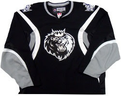
Like this one. It's a little nicer. The Manchester Monarchs are introducing a new monochromatic third jersey. There's a joke to be made in there, right? The Monochromatic Monarchs... I can't think of it.
Here, have a look.

Some have wondered whether to expect a similar jersey design for the Monarchs' NHL affiliate Los Angeles Kings when they unveil their alternate next month. I'm going to say no way.

But there's something I like a little more than all of these. And shockingly, it's an ECHL third jersey. The Victoria Salmon Kings introduced this new sweater to celebrate their fifth anniversary. It's very sharp.
I like the multi-purpose V on the front.


I'm a big fan. Better than a choking fish wearing a crown, I guess. (He's choking because he's not in the water... in case you didn't follow my line of thinking.)
As always, I'm happy to post new information, but you guys have to let me know what's out there. I'm pretty retarded when it comes to the minor leagues. I'm trying to get better though. Let me know if I've missed anything.
In the meantime, what do you think of these? Comment away.


9 comments:
every time i see any team using the sabres jersey design in new colors, i die a little inside. the ugliness and non-hockey-jerseyness kills me. why, monarchs?
that sharks jersey has some promise...but they really made some bad choices on it. the gray seems very...harsh on the eyes? i'm not sure how to describe it, but it looks abnormal somehow. then the logo above the S in the wordmark is a bit much. i've seen much worse (see: monarchs), but that's not good.
the wolfpack's doesn't make any sense. there's no RBK logos anywhere, no edge laceup style, and no rounded hemline. that has to be a throwback from somewhere, or perhaps a fashion jersey. unless i'm missing something...
but the wordmark is pretty snappy, i like the bevel on the bottom, even if it is inconsistent with the rest of the perspective. the MLB-turn-ahead-the-clock style logo on the hemline is a bit much...but again, there's worse...
I'm a big fan. Better than a choking fish wearing a crown, I guess. (He's choking because he's not in the water... in case you didn't follow my line of thinking.)
I'm not sure anybody ever follows your line of thinking. But then again, you're the one who gives us all this information, so who am I to judge?
Personally, I think that Salmon Kings jersey is plain. Although I still think it's better than the Ducks' log.. sorry, "wordmark", it's really not that creative at all and seems like something they just threw together because they had a deadline.
As for the Wolfpack jersey, I don't get putting a giant wolf head on the bottom of the jersey. Maybe if it were breaking out of a sheet of ice, then I would understand it..
I find it interesting that the Worcester Sharks still use the old logo, even when the SJ Sharks modified theirs for the Rbk Edge NHL. As for the jersey, I don't understand jerseys that are hard to place as a home or a road jersey, even if it isn't either of them. And I'm getting tired of jerseys like the Rangers and the Avalanche alternate. They defeat the purpose of hockey jerseys. Hockey is the only sport in America where the uniforms have the logo on the shirt. Baseball and basketball has wordmarks, while football doesn't have anything but a giant number (thank you, Thrashers). In that aspect, hockey tops the other sports aesthetically. It sickens me when teams go down the evolutionary ladder, so to speak.
Of course, I'm a Kings' season-ticket holder. Can't believe they blew the game against the Red Wings last night. But I refuse to speak about the Kings affiliates' jerseys until they decide to improve upon the monstrosity that is to be the Kings' third jersey.. okay, I will. That Monarchs jersey looks too busy monochromatic. If it were purple with some gold and silver accents, similar to the Sabres jersey it is modeled after, then I'd be all for it.
That Sharks jersey is gross. The color combo just doesn't work with the gray. I had some hopes for this one, but I would laugh if I actually saw a fan buy one of these.
It's trying to be different by adding gray as the primary color, but also trying to be like the big club by adding the horizontal SJ striping. Which just doesn't work. I'm even somewhat okay with the introduction of orange in SJ last year (the Miami Dolphins and NO Hornets have pulled it off better with their orange/yellow and teal, so there is some hope), but the grey is too light and the jersey is just too boring. Even with the *barf* Block lettering, with that logo above the S, it's hard to read. Very disappointing WorSharks.
Yeah that wolfpack jersey looks old. I don't think they use that wordmark anymore, and it was pointed out that it doesn't look very RBK edge-like.
A bunch of AHL teams have already worn their thirds including Chicago, Rockford, Manchester, Philadelphia, etc. So there's good pictures of them floating around now, fyi.
Those jerseys are hideous, they hurt my eyes!
The Salmon Kings is alright with its retro look but not great. For some reason, the "V" on the front reminds me of War Veterans or the Victoria Cross.
The Sharks thing is odd. It looks like the Gray is tinted tan, which looks really awful. And it's not my monitor, I use a laptop with a nice LCD screen. Color is very nicely balanced. And all the gray borders and the gray kings jersey look fine.
It could be a nice looking design in my opinion, if it was actually gray and not grayish Khaki- that's about the ugliest color imaginable and comes nowhere close to their color scheme (okay, at least the real sharks)
By the way, do the real sharks still have gray or is it just teal, black and gold?
The Wolf Pack one was a contest with jerseys submitted by the fans. I guess this was the best one.
The Sharks jersey would be better if the gray was a bit darker and if they armpit colour matched the body.
The Salmon Kings jersey is nice, but it makes me sad to think that anyone wouldn't want the awesome primary logo on their jersey at all times. FISH WEARING A CROWN~!
this wolf pack jersey was not the best one (i had 4 of them submitted lol)...but anyway i really hate it. i'm not a fan of white alternates...
i like the monarchs jersey...maybe the kings can take a hint...
sharks jersey was an interesting idea but was a bad execution...
Post a Comment