

 They beat me to the punch. On their official web site, the Montreal Canadiens are holding a poll, asking you to vote for your favorite of the six newly unveiled Centennial Jerseys.
Click here to go cast your vote.
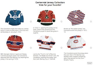
It'll be interesting to see which one is the most popular. I'm sure I'll have a poll like that on Icethetics at some point. Happy voting!


10 comments:
what the english version of the site does not say is this:
"Les chandails seront en vente dès que les Canadiens auront disputé un premier match avec cet uniforme. "
(jerseys will be on sale once a game has been played with them)
so this poll is probably a way to help decide on how many jerseys should be manufactured.
Blue jersey is the best.
I've always loved the white one with the blue stripe through it... BEAUTIFUL!
I'm betting the most popular could become a permanent third jersey, if so, the habs are doing it the right way IMO.
and thanks s-m for that news, I was wondering if they would go on sale.
yeah, the jersey of the 40's with the blue mid stripe is probably the best one there, but there is definitly something i enjoy about the blue one without it reminding me of the horrid Maple Leafs...
would be interesting to see the blue one with an inverted color verion of the current CH logo in it.. "could" be really interesting.
i personally like the red one with the black leaf and the white version of their current home jerseys. would be cool to see them use one of them as the permanent third.
Wow, I was curious about the "A" 1916 uniform, so I looked up the Canadiens' history. I had always assumed that the "H" was for "les Habitants". Little did I know that it was for "Club de Hockey Canadien". Now I feel silly. Of course, it turns out that the first person to call them "the Habs" was MSG owner Tex Rickard in 1924, who likewise thought the "H" was for "les Habitants", so I don't feel so stupid. For anyone that doesn't know, the "A" was for "Club Athletique Canadien".
They aren't all atrocities, but there's a reason they haven't gone vintage until now, I see.
I'm a sucker for stripes. I know the 'barber pole' jersey is probably considered an eyesore by many but it is iconic of sport in the early 20th century. That era is sheathed in a passionate romanticism for me. I also think those styles of uniforms serve more strongly as vintage sweaters because that particular style is so rarely used these days. It is genuinely a throw-back to an preexisting ethos as opposed to a being simple rearranged colour scheme.
Of the six sweaters, my favorite is the 40s design. I like how the design complements the classic red sweater, compared to the stark contrast of the red-shouldered jersey, which has always lookd rather plain to me.
The blue sweater - not bad, but the shoulder striping is rather unusual by modern standards, and kind of reminds me of the final jerseys of the California Seals... O_O
The red and black sweater just makes me think there are already more than enough teams with red and black color schemes... plus the maple leaf just doesn't feel right, considering a certain rival...
The barber-pole sweater looks okay, but again, there's a maple leaf logo...
The one thing that stands out for me for the red "CA" jersey is the solid blue collar. Traditinally, we think of the classic jersey with either a solid white collar, or a modern blue and white collar; I like the blue variation, but am not so crazy about the CA logo.
The red-shouldered jersey they show is, for all intents and purposes, their current EDGE uniform; I can only assume that for "throwback" purposes, they would use the older two-color numbers (blue with red trim) instead of the current three-color (blue-white-red) they've used since the Starter era.
Post a Comment