Tuesday, August 5, 2008
IHA Poll: Dallas Patriots
Cast your vote and leave a comment about your decision. If you chose a non-finalist, tell us which one. Then tell all your friends to drop in and vote! The more voices heard, the more accurate the results!
Starts Tue Aug 5
Ends Fri Aug 8
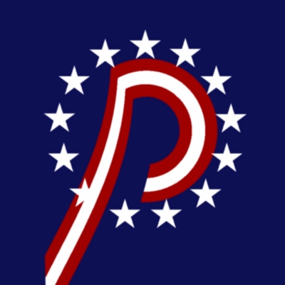
As promised, below are a handful of the logos that were submitted but not selected as a finalist. If you think one of these should be the Dallas Patriots logo, select "non-finalist" in the poll and tell us your pick in the comments.


14 comments:
I went with Non-Finalist #2, just looks like a better overall design to me.
o man i thought i would get my design in...it looked just like non finalist 2 but with patriots instead of swords
w//e i vote #3
non-finalist #2 for me
I chose non finalist #1 because it looks like its crossing out Texas.
Non-Finals #3. With a little polishing, that could be really sharp.
As a potential fan of this team, I don't like any of them. DP is Dr Pepper, y'all! Though if I had to choose, I'd say #3 non-finalist has the most potential.
Non finalist #2, though need to make those sabers/swords more visible.
I liked finalist #3, it reminds me of the Dallas Cowboys.
Non finalist 1. It's ACTUALLY the state of Texas, instead of the one submitted by Mrs. Hoover's 2nd grade class. (#1.....probably drawn by Ralph Wiggum).
Someone already said it, but DP is Dr. Pepper. That logo would not work down here.
#3 looks like the Cowboys star. Plus arent we trying to get away from the existing teams? Hello......Stars?
I actually think Non finalist #2 is the most conceptually strong, using the swords as the initials "D.P." I think if that star on the left side of Texas was removed, that would be a quality logo mark.
What happened to my submission? I thought using a Tricorn Hat was strong.
Yeah, this contest officially sucks now. Sorry.
What happened to my submission? I thought using a Tricorn Hat was strong.
Did you submit an original logo or a stolen one?
Yeah, this contest officially sucks now. Sorry.
I think that warrants a LOL. Really? Gosh, what don't you like about it now?
I went with non-finalist #3. In retrospect, I kinda wonder how it would work on a white jersey (since the background color is really an integral part of the logo). But none of the others do it for me. In fact, the only other one that's even tolerable in my book is Finalist #3.
Post a Comment