Apparently some Oilers jersey designs have been floating around recently. I guess the claim is that they're official concepts being considered by the team as a potential alternate or home sweater replacement. Have a look at see what you think.
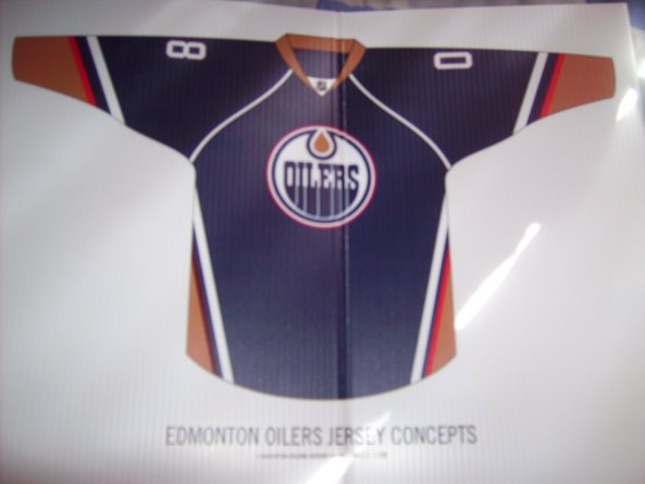
Like I said I can't vouch for the veracity of these images. Just take them for what they are.
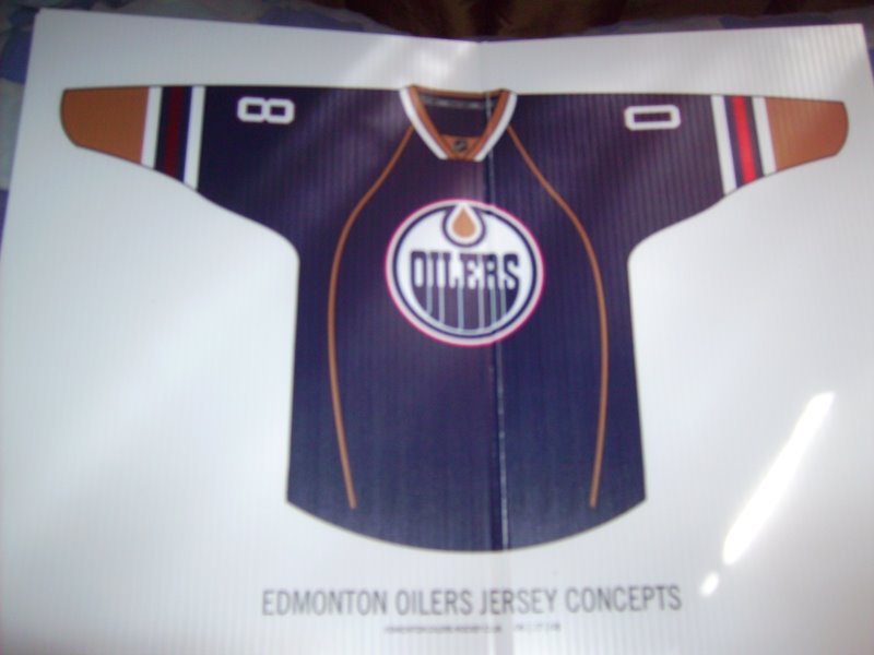
I like them both but the first one would be my favorite. Express your thoughts in the comments below.
Thanks to Zac for the tip.


20 comments:
The bottom one looks more like a modified version of their current home jersey than a third jersey. So I would suspect that it would be a replacement for the home jersey. Which makes me wonder what the replacement for the away jersey would look like.
As for the top one, it's interesting but I'm not too sure if it would mesh well with the evolution of the Oilers jersey over the years.
I love the first one... As for the second one... Its boring. All it has are... String- stripes down the body... And... Whats that? The inside of the stripes of the arms colours don't match. Ha! First one all the way.
The top jersey is better but both are overall weak designs. The Oilers have had much nicer jerseys in the past. The top one is an improvement over last year's jersey but I still don't like the white lines that cross over the "C" and "A" on the front. Just looks confusing.
At least the stripes go all the way around the arm this time.
Can't they just do a throwback? Just use the jerseys they had for Mark Messier night.
brutal...the first one has stripes near the bottom like Anaheim used to, which now looks dated, or something you see in pee-wee or Men's league hockey. Sadly, both are slightly better than our current montrosity. I would like to see some of the talented artists from this site please re-brand the Oil back to respectability.
I'm pretty much done with the armpit pin stripes that the NHL has decided are just great.
yawn...
could it get more boring than those designs?
The second one would be a great replacement. I hope this is true, beacause I cant bare the OILERS wearing there current uni's.
And I dont know why people like the armpit pinstripes, they look really bad.The arm stripes on the first one are fine, but the aempit ones aren't. It looks like the armpit pinstripes are made overnight.
either stick with the traditional stripes or not use pinstripes that look unprofessinal.
And the arm stripes that are differnet colours are'nt bad, but it's just new and different, kinda weird, but I'm sure people will grow to like them or atleast get used to them.
The first one is pretty good but I certainly hope they wouldn't consider the second one as their third practice jersey.
Stupid piping. Big fat idiot piping.
I think both jersey concepts look fine. They aren't amazing but they look pretty good. Just because it's new and the Oilers are going in a different direction than in the past Doesn't mean that it's a bad thing. I'm happy that they're showing some creativity and not just reusing a vintage jersey. Too many teams do that.
where are the banners on the side?
they should go back to the blue jerseys from the Gretzky era...those were really nice
hey im the one who sent the pics, i just forgot to say that these were made up on June 27th by the team's advertising firm, but discarded from consideration. So they probly wont be doing these jerseys but this may be the direction theyr going in
What's up with the one red stripe? Not a good idea.
Well hopefully they aren't making those. The first one is ok.
Well, both are better than the current ones...they are just so plain! The ONLY striping is on the sleeves and it only goes halfway around, like the Panthers.
I say bring back the vintage design.
Hopefully those are just some stuff from last year when they were busy thinking of ways to ruin our jerseys. I'm all for getting rid of the current mess, but don't waste a change on any of these. Better than what we have now? Yes. Good? No. Go all the way and do something that actually looks good.
These are castoff's that the Oilers rejected ftw. These are dead
The first one is a vast improvement over their current one. I am so sad to say.
But the second one sucks worse then the current jersey. Honestly, I hope these are a joke but that hasn't stopped me from spreading the jersey rumor. I think everyone here wants to see a new Oiler jersey. I personaly like the ones you showed a few months ago with the White shoulders and copper. Man those are plain awesome! These suck (but the first doesnt suck as bad as the current one)
Bring back the classic 1980s/early 1990s Edmonton Oilers jerseys. They won in them, they should bring them back.
I don't mind what they have now, but I cannot stand the piping the Oilers, Predators, Panthers and a few other teams have. They serve no purpose... get rid of them!
I happen to love the piping, the chest would look too blanks on all those jerseys without it
Post a Comment